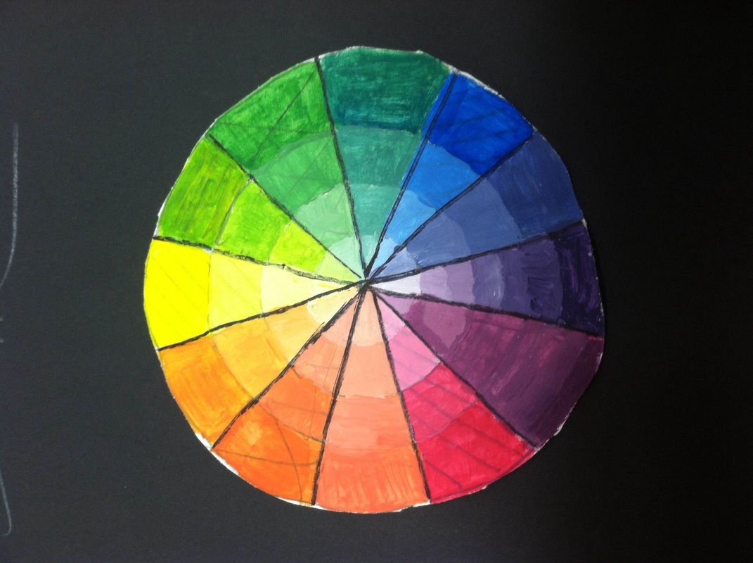
The primary are yellow, red and blue. The secondary are orange, green and purple. The tertiary colors are where you mix two colors together to make the inbetween color. I think the hardest color to make was the red-purple. To make tints in your color wheel you add white once you get closer and closer to the middle. For my primary colors I used lines. For my secondary I colored it alittle and for tertiary I x'd them. I think i did well on getting them from dark color to lighter. Something i need to work on is making sharper lines painting
The difference between one point and two point perspective drawing is two point you have 2 points to put lines too. It makes it look more 3D. The thing that worked well in my name was getting smaller when i went on with my name going towards the points. The thing i struggled with is putting a top on the top of the letter. but i got it after awhile. The historical building I choose was the St. Louis depot in like the 1900's. I choose this because i wanted to draw something that was in my hometown along time ago. the part i struggled with was the siding lines on the front side. the thing i did well on was the pop out section of the building.
A horizon line is a line with one or two vanishing points. The vanishing points is a point where you take all the lines to make is look better. With my birds eye view drawing the only thing I liked was how cool it looked, but the thing i did well on is making every line of the windows go back to the vanishing point. The thing I struggled on is making straight lines even though i used a ruler. With my redesigned hallway, I added a couch and a tv. the hardest thing with the one point perspective was the couch. I liked the couch in the hallway.
|
AuthorWrite something about yourself. No need to be fancy, just an overview. Archives
June 2015
Categories |