In this project I learned that it's not easy. I also learned that it's not all about hustling through it and not taking your time, it's about getting the right shading throughout the face and getting the right details on the face.
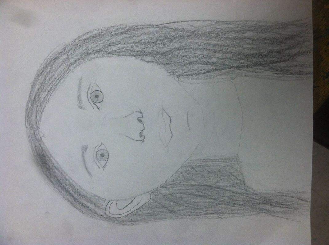
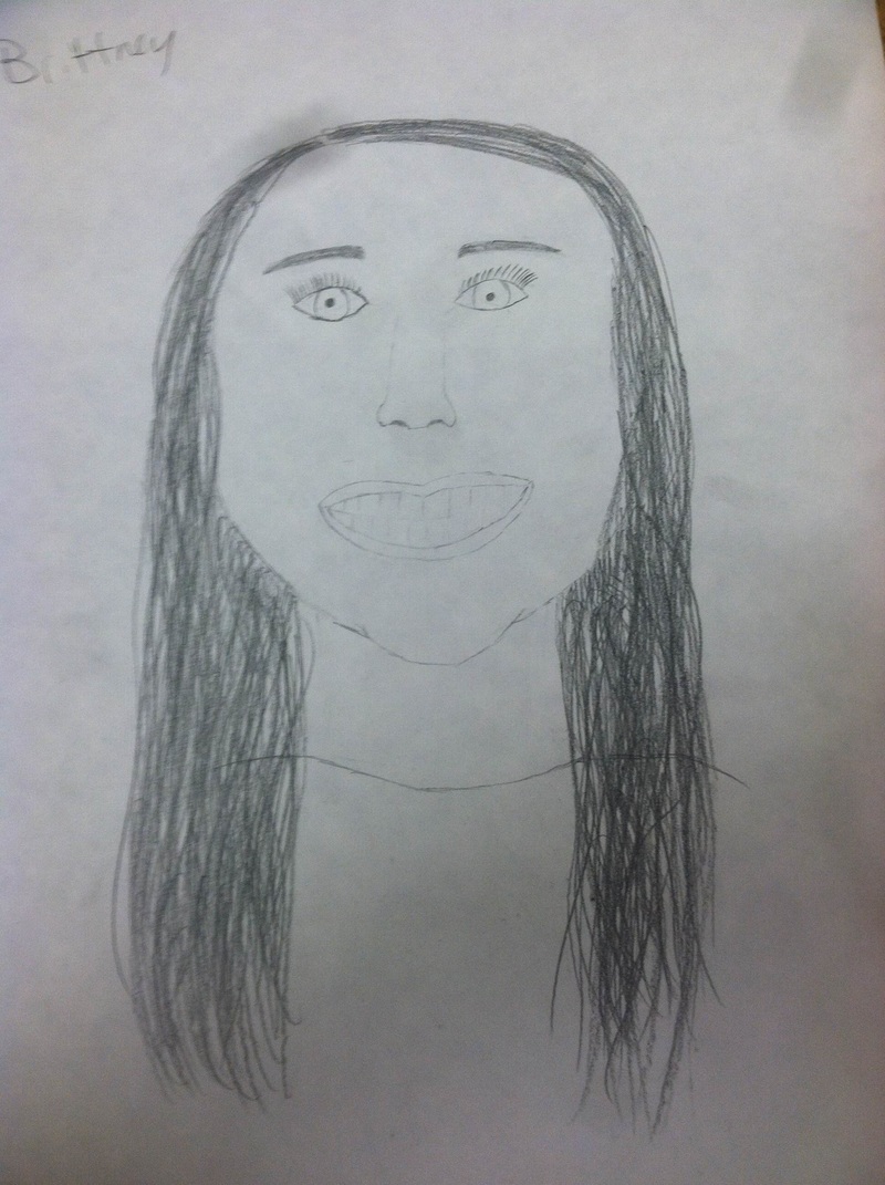
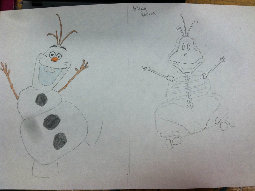
The process of these drawings was to get the face the right shape of the persons head. After I got that finished, I had to line up the eyes, nose and mouth to make it look normal. The eyes were the hardest thing because I couldn't line up the both eyes or I couldn't make them look the same. For the nose I couldn't make it to look right the first couple times, and for the mouth, that was probably the easiest thing. For the hair in both pictures, I couldn't really make it look like it was wavy, so I made it look as good as I could.
In this project I learned that it's not easy. I also learned that it's not all about hustling through it and not taking your time, it's about getting the right shading throughout the face and getting the right details on the face.
0 Comments
The process of this painting this banner was difficult. I didn't draw it on the banner, but i did paint it. I started paint this flowers and the trees first. Those were the easiest things. Then I started on the grass. I tried to make it look like real grass. I think I did pretty well. I then started on the road, which was hard to get the right color I wanted. I didn't want it to look too dark to look bad with the dirt from the flowers. After I got it, it didn't take me long. The car and the bus were the hardest thing. I was scared that is wasn't going to look right. For example, I didn't know what color to do the windows. I also didn't know the shape of the car from up above. In conclusion, I don't think it looked that bad after all.
In the painting I learned that it's easier to paint on banner material than paper. The banner took it more smoothly than paper does. I think it was very fun painting this poster! The process in this assignment was to make all different kinds of designs all in one. On a piece of paper I started one designs then just hooked another design to that and so forth until the whole page was full. For some design examples I had checkered lines, shapes, diagnled like and others.
From this project I learn that is looks pretty cool when its done with all the designs on it together. If you do it nice and neat with no mistakes like having straight lines, it will look more sharper. For the aboriginal dot painting I drew the picture of the objects in the picture then I carefully made dots in a different color around the drawing. I did then do a different color dots around everything else. Around EVERYTHING I used a complete different color to bring out the objects.
In this project I learned that it is very fun to make a lot of dots, and it brings out all of the objects in the painting. My story for this project is that we are the Sharks and all the fish are the opponents we play in all the sports and we like to eat them(aka win). I choose the colors I picked of the fish because those are the colors of the teams. Red & white means MLS, yellow & blue stands for Breckenridge, Ithaca and Valley Lutheran and black and orange represents Merrill. In the process of doing this cell animation, I had an easy time painting the character. Although it was hard finding a good background angle. For the character, I just drew some random shirt and pants. I do like the way my golf club and ball turned out. For the cell, I traced the character that I had on paper onto the cell. I then painted it. For the background, I drew it first then I painted it.
For this project I thought that it was easy to use the acrylic paint on the cell. There was at paoints were I got paint where I wasnt suppose to and it came right off from me scratching it. In the processes of making this drawing, I had to make sure I had to make sure I had the right angles on the character to make it look right. It was easier than I thought it would've been, but the head and skeleton was the hardest part. In the skeleton, it was hard because snowman obviously dont have bones or a skeletal system. So, i did my best making ribs and bones.
In this project, I didnt really learn anything new besides that making a skeleton system is really difficult to make! The first thing I did to start my clay cup was smack down the bottom to make it flat. I them used a cup to cut out the circle. Next, I made coils about 10 inches long. I made about 4-5 of those depending on how tall you wanted it. Next, i smoothed out the sides to make it look better. Then you had to make the handle. This one I had trouble with because i had to get it the right size. i then had everything done like the design and shape i wanted it and just went over with slit.
I learned from the clay that it is not even close to play-doh. I really like how you can rub it and it smooths out. you also dont need to push on it hard to make it function how you want it too. you can just barley rub it and it will make a dent in it. I created my symmetrical painting by using circles, triangles, and squares. In my asymmetrical drawing I created balance by having one big object on one side then having two small objects on the other. The color scheme i used was orange and blue. They're colors right across from eachother on the color wheel.
The primary are yellow, red and blue. The secondary are orange, green and purple. The tertiary colors are where you mix two colors together to make the inbetween color. I think the hardest color to make was the red-purple. To make tints in your color wheel you add white once you get closer and closer to the middle. For my primary colors I used lines. For my secondary I colored it alittle and for tertiary I x'd them. I think i did well on getting them from dark color to lighter. Something i need to work on is making sharper lines painting
|
AuthorWrite something about yourself. No need to be fancy, just an overview. Archives
June 2015
Categories |